6 months into Creed’s Brand Refresh
Six months ago today, on March 30, 2022, Creed celebrated its 15th Anniversary. That day was significant for a number of reasons–first, while days may seem long, the years fly by in an agency. Time is measured by project kickoffs and launches, but also by release schedules and Jira tasks and before you know it spring has become fall, and one year becomes three…or fifteen.
Second, celebrating fifteen years means that we have surpassed many small business hurdles and growing pains; but we must continue to set ourselves up for success for many more years to come. As is healthy in the journey of any business, as we approached this milestone we felt it was important to evaluate our brand, brand identity, core values, services and value to the marketplace.
We knew we wanted to maintain what made Creed successful for its first fifteen years: a solid foundation of core values, integrity, and great work. Our core values of Serving Others and being Wholehearted have helped make Creed All In in all that we do. This isn’t just a tagline, it is woven into the fabric of our culture.
Accordingly, when we set out to refresh the Creed look and feel we knew it was not going to be a complete rebrand– as we wanted evolution not revolution. We built upon our strong foundation of values and pushed ourselves to think forward to what is on the horizon. It is important for us to remain timeless and ever evolving, like the technology we create.
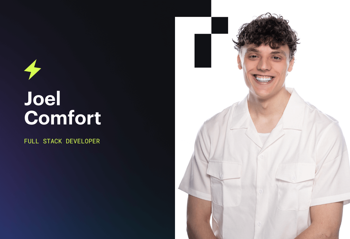
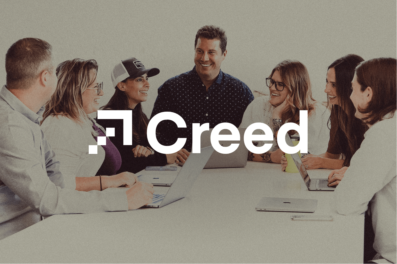
Most importantly, we wanted our brand refresh to reflect the voice and talent of nearly every single Creed team member. From our Discovery phase, which included surveys, SWOT analysis, stakeholder interviews, and iterative design, we are pleased to share a bit more about how we came to evolve our logo and brand identity.
Shameless plug, we also offer these services, so if your organization is thinking about embarking on this journey, please keep us in mind.

A few features that we highlighted in our brand refresh include:
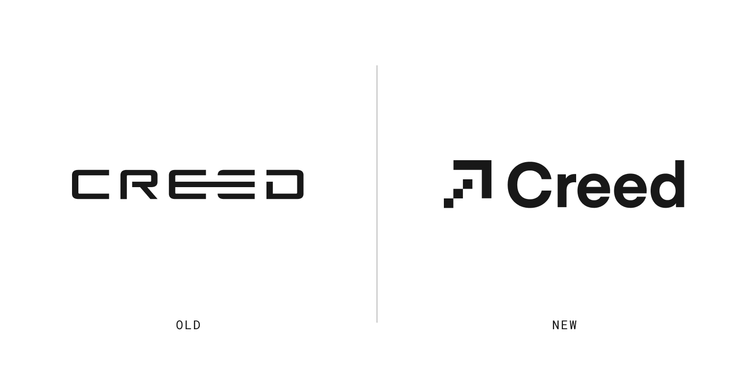
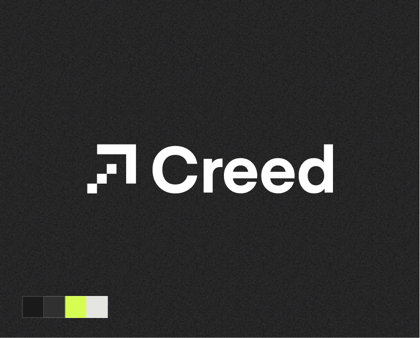
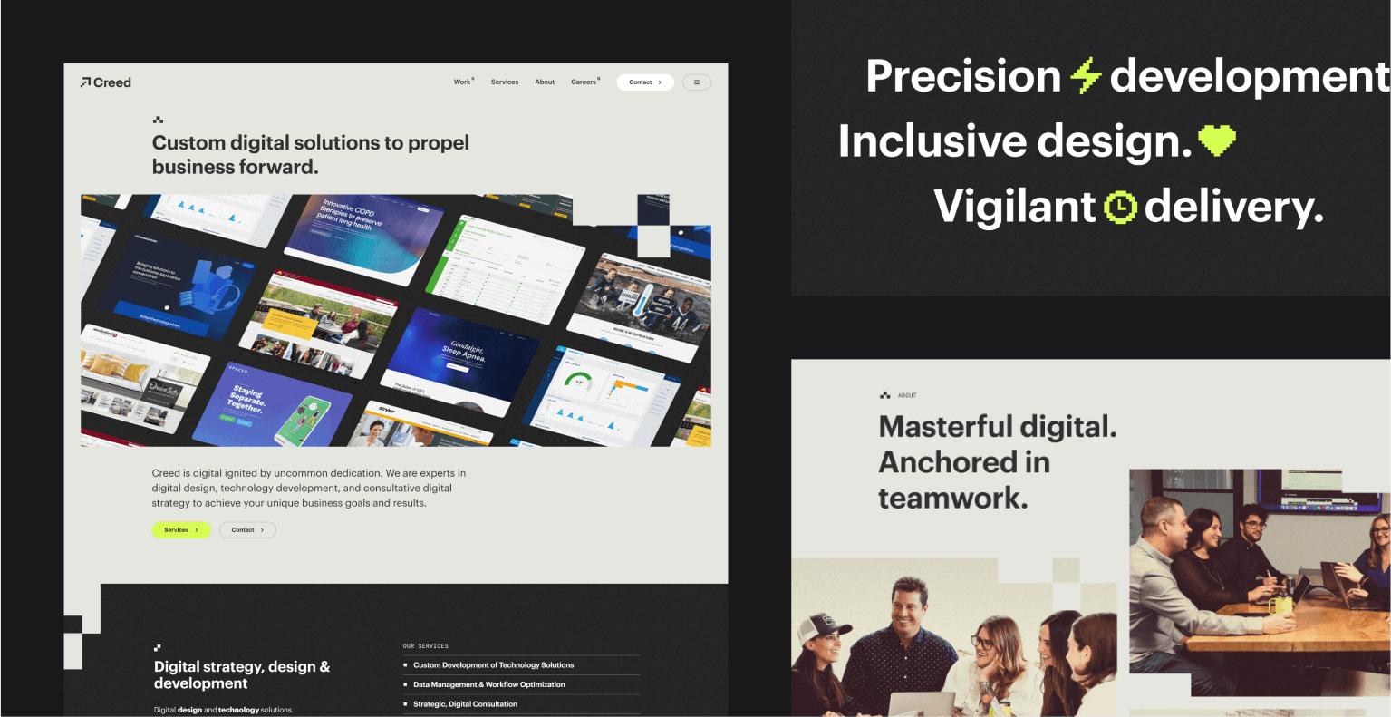
- An updated logo that nods to the “arrow” found in our previous Creed logo, but is now positioned to represent forward, upward, and positive momentum. It communicates our visionary and strategic approach to building a better future for both our clients, their customers, and our people. It is constructed using precise, geometric shapes in the form of pixels as a salute to design and code. The form also conveys modernity and balance. Leadership and inclusivity are personified by the arrow–we are your digital guide and expert in the journey of a brand and digital product.
- The wordmark was created using a sans-serif typeface called Eina. By pairing it with the geometric precision of the arrow icon, we soften and humanize the mark to create a balanced and clear identity.
- The three geometric block shapes in the arrow represent the evolution of Creed’s core values, previously represented as Wholehearted, Excellence, Serve Others, and Resourceful to a more focused set of three core values:
- Ingenuity: representing our insatiable desire to be curious, to boldly solve challenges, and to consultatively find excellence in our work. This allows us to be Resourceful, but also future proof and enables even more room for creativity, learning and growth.
- Dedication: this builds on our previous core values of Wholeheartedness and Serving Others, and we believe is a big part of Creed’s not so “secret sauce.” So much so that our updated Vision Statement now reads, “Creed is digital. Ignited by uncommon dedication.” This “uncommon dedication” is to our work, to our clients, to our community, and in how we show up for one another, every day.
- Mutual Respect: Creed has always been a respective and inclusive workplace and we treat our clients’ business like it is our own. Accordingly, we will have tough conversations if it’s in the best interest of our team and our clients, we never skimp on doing what is right, and we remain “All In” in all that we do, because that is how we continue to show the utmost respect for each other and our work. That is our promise–our creed.
- In addition to updating our logo, typography and brand voice, we also updated our brand pallet. We shifted away from the primary colors of yellow, red, and blue and leaned into a more neutral palette of grays, putty, black, and white so that our work, clients, and team are the main focus. That said, in keeping with some tradition, the team was excited to evolve our former yellow to the bold, yet timeless, “highlighter yellow” (aka Bolt) that we use to “highlight” and accent as needed.
- Last but not least, we wanted to evolve our mission statement to portray what makes Creed unique and special. Our updated mission statement now reads, “Creed is a people-first, digital agency that goes All In to drive our clients’ business forward.”
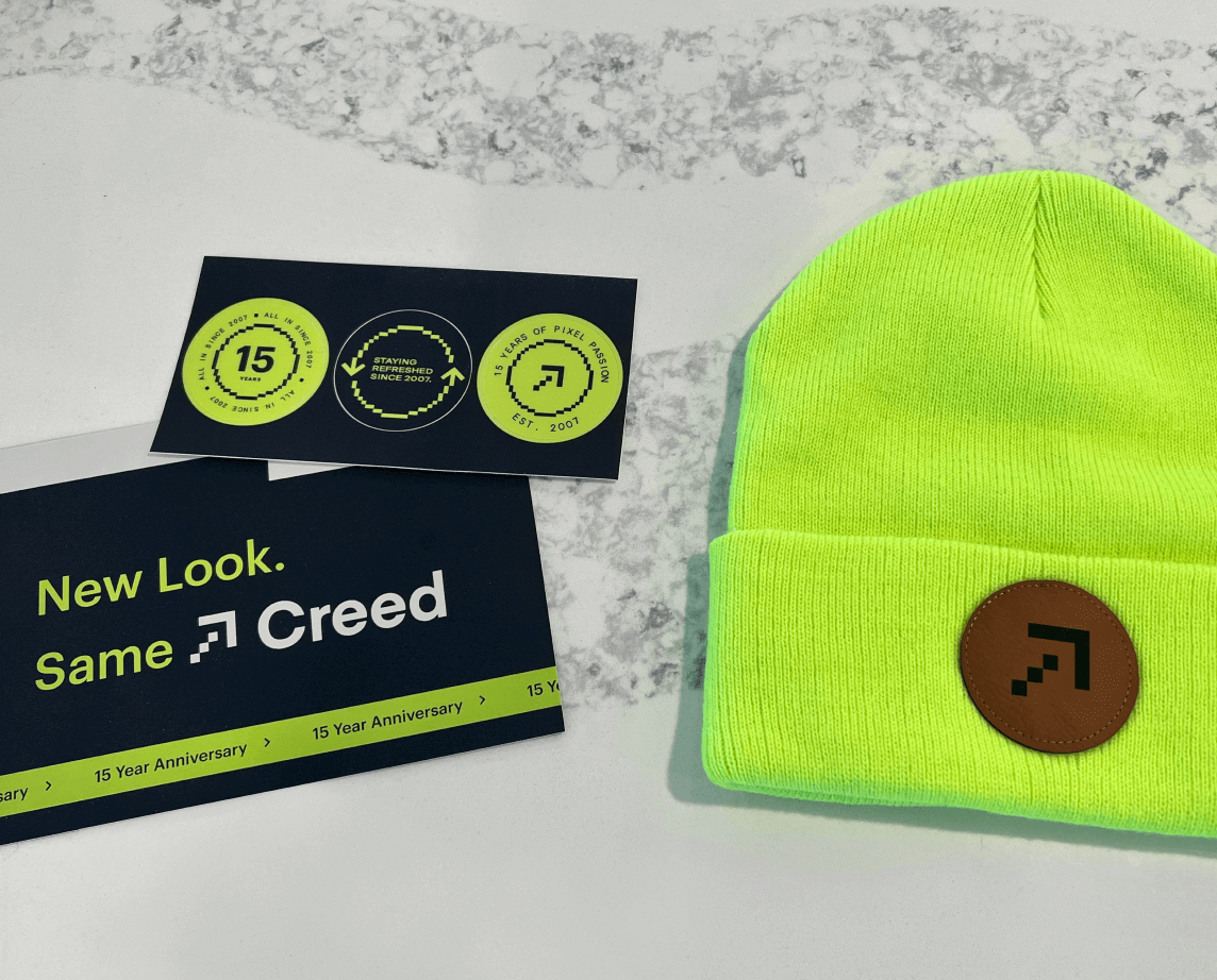
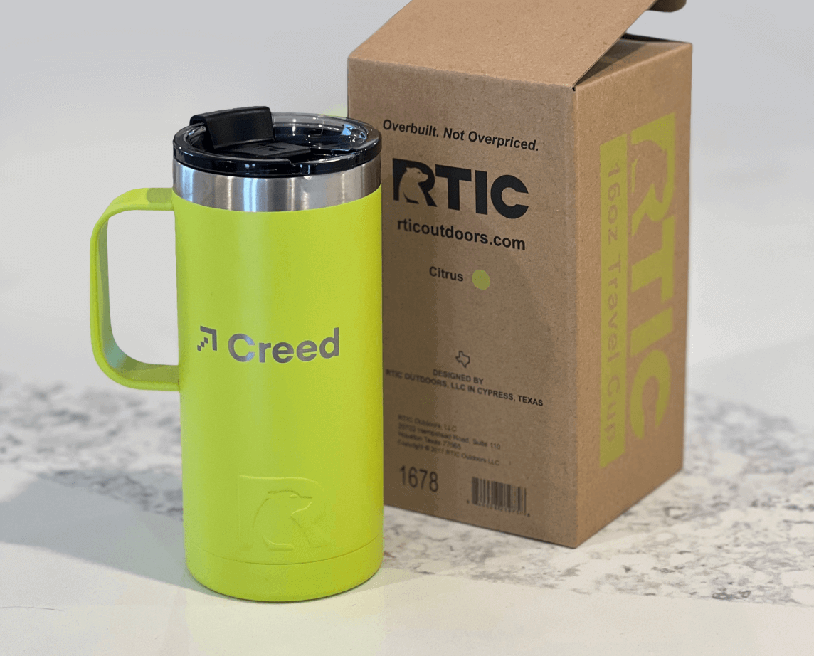
At six months in, we have fully leaned into the brand refresh. We have infused this fresh energy deeper into company culture in the standard practices of signage, swag, and celebrations… but also into our team member reviews, Slack emojis, and into our recent award winning website update. We are proud that we have remained true to where we have been, yet continue to look onward and upward to drive our clients’ business forward, and in turn ours as well.
Watch the video we released last March to announce our brand refresh.