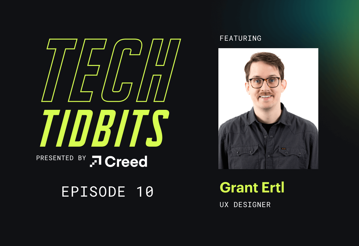
Tech Tidbits Ep. 10: Grant Ertl

Chris: Hello, Grant. How are you doing?
Grant: Hey, I’m doing well, Chris.
Chris: This is Grant, he’s a UX designer here at Creed Interactive. Thanks for taking the time to talk to us today, Grant. I appreciate it.
Grant: Yeah, of course.
Chris: Are you ready for some UX-related questions?
Grant: Yeah. All right.
Chris: Here we go. First one, what are your responsibilities as a UX designer at Creed Interactive?
Grant: So, the job here as a UX designer for me really varies a lot. I think the biggest thing that I try to keep at the forefront is to make sure that what we’re delivering is intuitive, human-centered, and designed well. It should be easy to use, make sense to new users, and not confuse people who have been using the same technology for years if we’re updating a new interface. In addition to that, I’ve been doing a lot of motion design, video editing in a marketing capacity. I love the variety because it keeps things interesting, and I never feel like I have two days that are exactly the same.
Chris: Very cool. Are there any common misconceptions about what UX designers do?
Grant: Yes. I feel like half the things I see on Instagram are just clarifying what is UX design and what is UI design. I’m hoping that eventually, this will become something people more or less understand. It’s been emerging over the last 10 to 15 years as screens have become more present in our lives. UX design combines psychology, data analytics, graphic design, and web design to make interfaces feel immersive. On a micro level, it can be a single interaction like a menu or button, and on a macro level, it’s the entire architecture of a website. So, it really spans as small and as big as you can imagine in terms of interface design.
Chris: Cool. What sort of things do you take into consideration when you’re designing digital products?
Grant: The biggest thing is the specifics of the user, always going back to personas or archetypes of the people who are going to use the product. Working with a researcher is huge for that. When working on something new or building on something established, it’s important to see what’s already working and not try to reinvent the wheel. If something works, figure out why and see if it can be integrated with what users already know to avoid a new learning curve. Accessibility is crucial, and it has to be part of the process from start to finish. Ensuring contrast, button sizes, and text sizes are appropriate helps make the design work well for everyone. I try to remember that the web is for everyone.
Chris: Yeah, that’s a good way of putting it. How do you get extended longevity out of your digital designs?
Grant: Longevity is easier to achieve than ever. When I started, making websites involved creating wireframes in Photoshop, cutting them into pieces, and assembling them in HTML. Now, so much can be done directly in HTML and CSS, and everything adapts to different screen sizes. There are well-established components that users are familiar with, so we don’t need to rethink everything. Testing with users to ensure functionality matches their expectations is crucial. Aesthetically, keeping things clean and simple, with plenty of white space and well-balanced colors, helps ensure longevity. Less is more, generally.
Chris: What trends are you currently tracking in the UX space?
Grant: Artificial intelligence is the big one. Seeing how it’s getting integrated, like some web design programs that can create an interface for you, is pretty wild. I listen to a podcast called Hard Fork from the New York Times, which talks a lot about AI and its applications, including self-driving cars. Designing for machines, like how a car sees the world, is another trend I’m following. It’s very Matrix-like. Another trend is the use of Lottie animations, which are lightweight and rely on SVGs and code rather than pixelated images. Airbnb created them, and they allow for fun, dynamic movement in designs.
Chris: Yeah, I’ve been meaning to look into those. They do look interesting. There are a lot of different lists that people use to explain UX design. For example, the five elements of UX design with strategy, scope, structure, skeleton, and surface. Do you have any particular frameworks that resonate with you and help define your approach?
Grant: Yeah, I was looking through some infographics I’ve found helpful. One that stands out uses the three areas: understand, explore, and materialize. Within ‘understand,’ there’s empathize and define. ‘Explore’ includes ideate and prototype, and ‘materialize’ covers test and implement. This framework aligns well with my approach to UX design. And there’s kind of a, even like a movement away from Solutionism as they call it now, where it’s just like, you’re just always making things better. Like thinking of anything as kind of being done…there really isn’t like an end goal. It’s just like, you can always make it better. You can always research and I think you just have to do the best you can and optimize. And I like that idea.
Chris: All right. How does non-traditional media, for example, the cool music video that you directed, how does that influence website design?
Grant: Yeah, I think as far as background is in film production. That was what I did for an undergrad. I’ve done a lot of stuff with video. And I think what I’ve kind of started tracing it back to is just like, I have like a love for storytelling and just, and I like making things move a lot. And having that medium is just so great for that. When I did a UX bootcamp through the U of M, we made storyboards to kind of illustrate the function of a design. And I never really thought about how design could tell a story until that point. It was kind of like a revelation. And I made that kind of, my kind of, what, advantage is in the UX / UI realm, is this background and kind of storytelling. And I think as far as like drawing influences that from that is like seeing the way that things move and like trying to find how those could be used in an interface, like how an organic movement could be kinda incorporated more into the way that somebody interacts with something versus just seeing it. And then the idea of like color palettes too. I think if you watch the way a lot of cinematographers will shoot things, they’re really selective about how they, they frame these shots and like what sort of colors they pull in. And there’s could be a lot of meaning behind that. I think about that when I’m building a page and how I balance it and like where the colors are and how, they call it the Meison Zen. So I don’t know if that applies to a webpage, but that sort of thing is really interesting to me.
Chris: Very interesting. All right. How does interactive design impact the quality of websites?
Grant: I dunno if it’s like the margins or whatever, but the competition is pretty, pretty tight. So when I think about the way that like one interaction maybe is the way that a hamburger menu opens, and if you think about when you’re using an app, you want to have that immersion, and when you click on it, you kind of expect that kind of, that natural motion of it, like pulling out. And I think that’s you, it’s not, I don’t know if people think about it on a conscious level as much as like, kind of a subconscious level, but it’s, it’s that kind of natural organic feeling that, uh, makes an app so much better, um, than just like if it’s, you know, just if you click on it and it opens up, it, you, you kind of, you make the association. It’s like, well, I’m just, this is a computer program, this is a piece of software. This is, this is a website. I’m not like, I’m not doing what I want to do. I’m just kind of, I’m using it, but I’m not, it’s become less of a tool at this point. It’s become just more of like, just to know another interface I suppose. I dunno if that makes any sense, but that’s kind of, no, I get you how I think of the advantage.
Chris: Okay. Cool. All right. What do users look for in modern websites?
Grant: I think the biggest thing is high fidelity images. Like having it like balanced all the content looking like where you would expect it to be. There’s gonna be like more like 3D in the future. Is that not a white space? Just keeping things so that it’s, there’s never like an overwhelming amount of color or a lot of different elements competing with each other. A lot of it’s just a lot of cohesiveness and kind of balance a good contrast. And then, I think that there’s just like a lack of anything that’s super distracting there. There’s a real, we all know now people who have been like doing web design and UX for a while to like how to draw the focus to like, one thing. And it always reminds me of the Frank Stanza in Festivus, the Festivus episode where he is like, he is like, “I find tinsel distracting”. So just try to keep the, the tinsel to a medium on your website, if that makes any sense.
Chris: Interesting. It shouldn’t end every one of these responses with does that, if that makes any sense. But yeah. All right. We made it to the bonus question here. So I took a look at your website, your personal website, and I really enjoyed the creativity. I can’t help but wonder, were you that kid growing up that was always drawing really cool stuff? And if so, do you still have a box of crayons?
Grant: Yes, I was, I have always been a bit of an artist. I was always draw, like when I was really young, I used to draw like Ninja Turtles and stuff. And I still draw that type of stuff. Like I’ll draw like my D&D characters and whatever. For a long time I would just use pencil. I would draw with just black and white pencil. And then when I eventually I started using, and this was like way later, I started using ink pens. ’cause I really liked seeing everything like super high contrast, like white and black. And then even more recently, like even in the last like five years, I started like using color a little bit more. And I think I just got sick of the black and white. ’cause I’ll just draw things out with with a marker. I’m into markers ’cause I like the brighter colors. So yeah, I went from the pencil kid to the, to the pen kid to the marker kid, I guess. And yeah, and I still carry, like, I have it right here, like these, like these markers that I really like. And I’ll usually have ’em in my backpack to like draw things out.
Chris: Very cool. All right. Well Grant, thank you very much for taking the time to talk to us today. I appreciate it and it’s time to get back to work.
Grant: Sounds good.