
Child Care Aware of Minnesota Releases a Totally Refreshed Website in Partnership with Creed
Creed recently completed an exciting website redesign project for Child Care Aware of Minnesota, an organization dedicated to providing free tools and resources to help families find quality child care and early education programs. The primary goal was to create a more modern site that would make it easier for both families and programs to find the information they need.
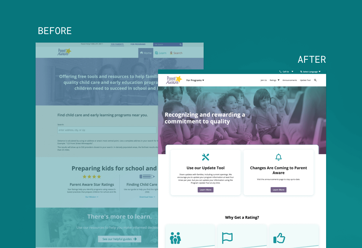
The Opportunity
Child Care Aware of Minnesota’s previous website was outdated and difficult to navigate as users often struggled to locate relevant information. The client recognized the need for a complete overhaul to better serve their diverse user base. First, for families seeking care providers, information on how to pay for child care, as well as resources to make more informed educational program decisions. Second, Child Care Aware of Minnesota needed to serve the Child Care and Early Learning Program providers seeking information regarding Minnesota’s Quality Rating and Improvement System.
Creed’s Solution: UX Research, Design + Development
Creed conducted extensive surveys and interviews with parents and childcare providers to gain deeper insights into their needs and preferences.
One of the core features of the updated website’s navigation is that it offers a dropdown that switches between the sections of the site, dedicated to each unique audience and their specific needs. To make it even more intuitive, each section is color-coded (purple for Families, teal for providers) to offer a more distinct separation of user navigation, while carrying through a complimentary design.
Also during the UX process, much evaluation was done to display content in an easy-to-use way. Creed’s solution was to create intentional layouts of the user journey content so that it created a seamless and intuitive experience for those that matter most, the end users.
From an aesthetics perspective, the design team used soft corners on images and content containers to imply a sense of safety and thoughtfulness, mirroring how you would prepare a space for children. Creed was also intentional about streamlining the brand colors down to just teal and purple, incorporating blue as an accent color while still portraying that cool and comforting tone.
Once the design was completed, it was onto the coding and build of the website. Creed’s developers utilized WordPress, Vue, and SCSS, leading to an intuitive layout and beautiful, easy-to-navigate website.
The Result
The redesigned website successfully bridges the gap between the two audience groups while maintaining a cohesive and modern aesthetic.
Key improvements include:
- A clean, intuitive interface with clear pathways for both parents and providers
- Enhanced search functionality to help users quickly find relevant information
This project reinforced the importance of thorough user research, especially when serving distinct audience groups. By deeply understanding the needs of both parents and child care providers, we were able to create a solution that serves both audiences effectively without compromising the experience.